SMG | 2023
SMG New Vision
Reimagining a new desktop platform for SMG to provide clients industry-leading experiences
6
Months
1
Platform
Role
UX Researcher
UX Designer
Outcomes
Validated product vision
Clients' satisfaction
Confidential Project
Due to the nature of the project, I can't share specific details of the work…
However, I can walk you through what we did on a high level.
The problem
From years of discovery with the clients and learnings from the them using the current platform, SMG wanted to make a stride and revisit the product offerings for the clients.
Due the complexity of the internal tools, high-cost maintenance of the platform, and the overall outdated platform experience, redesigning the entire SMG 360 platform was the decision. The new platform was intended to provide easily accessible, actionable and more business impactful data to help clients' achieve their business goals. A quad made of UX, Data Science, Dev, and PM was put together to work on the project.
Image was purposely blurred
How we solved it
Revisiting historical data
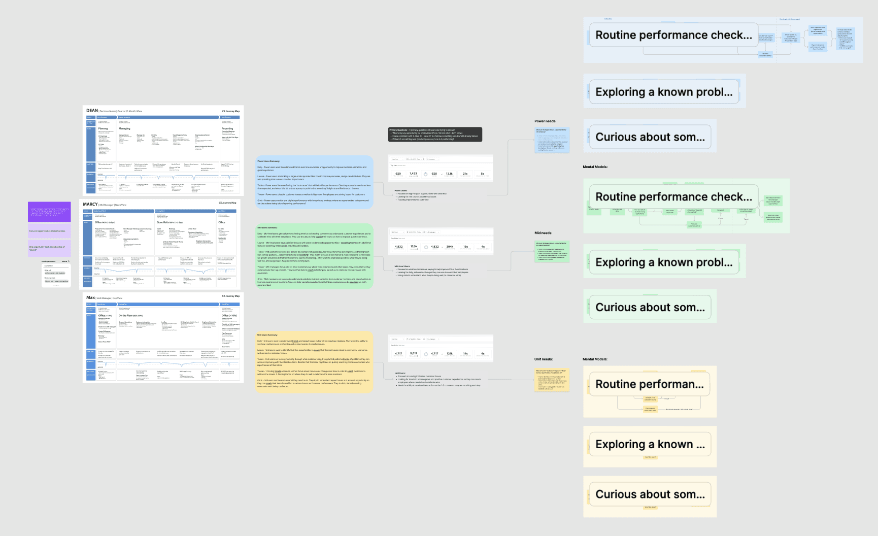
The initial scope was set to be the entire platform, so the team started with going through all client personas' user journeys, problems to be solved in the platform, quantitative data from Pendo, and mental model flows as our jumping point.
Proposing a new Information Architecture
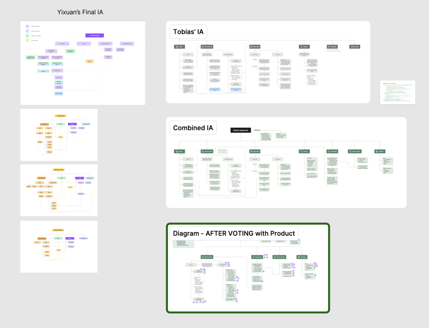
Analyzed the historical research data, I worked with the other designer on the team for a Information Architecture based on the problems we summarized. We walked through the IA with Product to vote for items we wanted to tackle in the MVP.
Initial prototyping
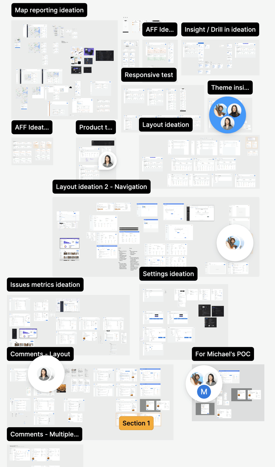
With the MVP in mind, we worked hours to produce "the messy" work. Bringing the concepts to life was a challenging task as one item could end up with tons of ideas due to SMG's complex CX data nature.
Continuous Discovery Habits
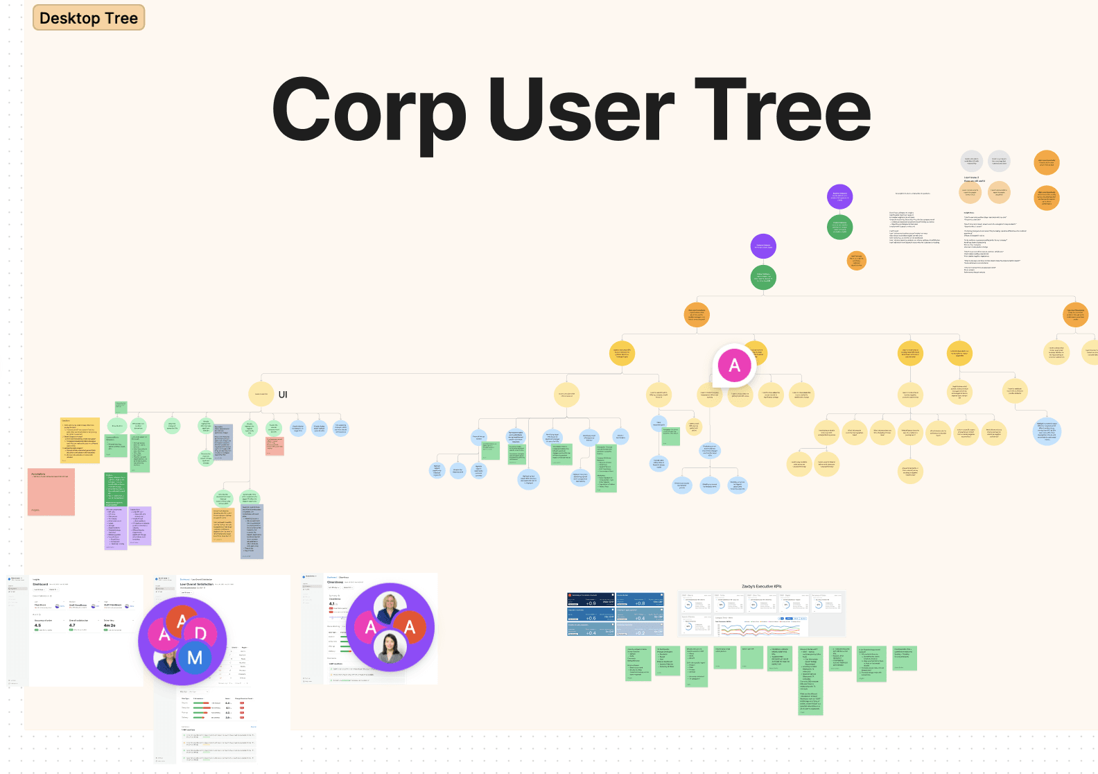
Honoring the Continuous Discovery Habits, the entire Product team was introduced to this framework to help prioritize opportunities to tackle. Our first focus was "I want to see which KPIs have or will have the greatest impact on financial results" for corporate users".
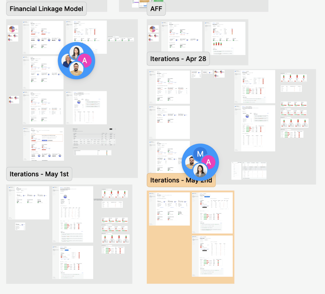
New prototypes + tests. And repeat…
With the quad, we continuously talked to clients, ran through several iterations of designs and tested the designs. One thing this methodology worked well on was being able to have quick turnarounds on user's feedback to the designs, which was what needed for the team to deliver the platform by the deadlines.
Here are a few highlights of what clients commented on the designs ↓
"This is great! I really like the summarization of a topic on a single page like this."
👤 Participant 152071347
"It is very easy to read and provides me specific information that impacts the next visit or time I spend with the franchisee."
👤 Participant 152104426
"Transactional insights aren't helpful. Is sentiment positive or negative in these instances?"
👤 Participant 151745736
"Love how it drills down all on one page."
👤 Participant 151157815
"A lot information to improve."
👤 Participant 151221423
"Love it! Brings the "action" to the insight. "
👤 Participant 152789382
"I think the celebrate page is good to show when you are winning. There should maybe an option to toggle to where are the opportunities and the color can change to highlight those"
👤 Participant 151905993
…



Adopting a new Data Science model in the designs
The complexity was getting stronger trying to brainstorm around what a new Data Science model while focusing on our first opportunity. The quad put our heads together to ideate, design, iterate and test for a new concept.

Accessibility Testing
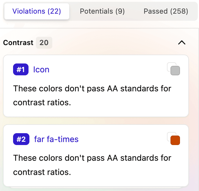
Although our design system was made to take care of most accessibility issues falling under the "Perceivable" category in WCAG, I ran the designs through an accessibility Figma plug-in called "Stark" to catch what we missed. I also introduced the tool to developers to ensure the designs are WCAG compliant in the code.
Putting in real code
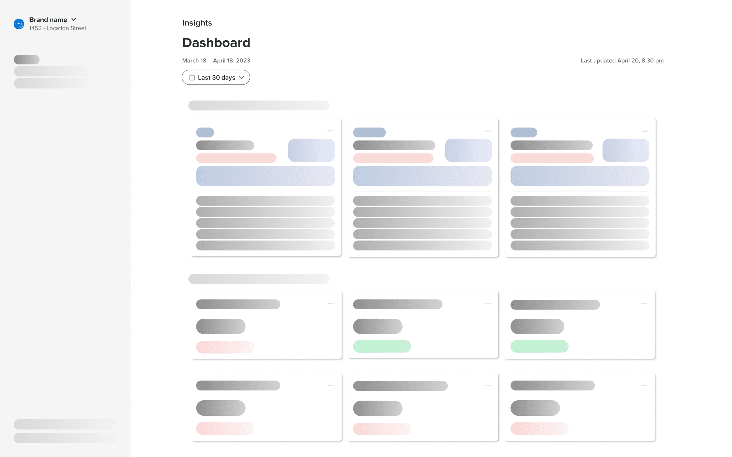
We were at a good point where the devs could start putting the designs in real code and testing out feasibility for some of the concepts we proposed in the design. We had close conversations together to tackle on different challenges such as how to better display a sentiment chart, what data should be presented on the page vs. on hover, etc. The collaboration went smoothly as the devs were informed with the designs from day 1.
The next chapter
We had set the foundations of the new platform by landing on solutions for Opportunity 1. The new org change decided to have a different team to work on the rest of the project and had me start a new project with a different team to solve problems for a different piece of the platform. I onboarded the new designer onto this team to continue the great work for the new platform.
Learnings
Don't fit too much on the table at the same time
One lesson we all learned from this project was we tried to do so much at the same time. Redesigning a whole new platform, working with a new team, and learning a new product framework at the same time created problems such as resources allocations, prioritizations, communications and coordinations. We all were spread too thin to be as productive as we would want.
Continuous Discovery vs. UX
As a designer myself, it was my first time working under the Continuous Discovery framework. While I found the methodology helpful in prioritizing initiatives, it was hard to empathize with the users by not using the traditional UX framework for research and user insights. A lot of times I felt like I had to "jump right into the designing phase". It was also difficult to determine a right point to do usability tests that would make the most sense to the entire team.